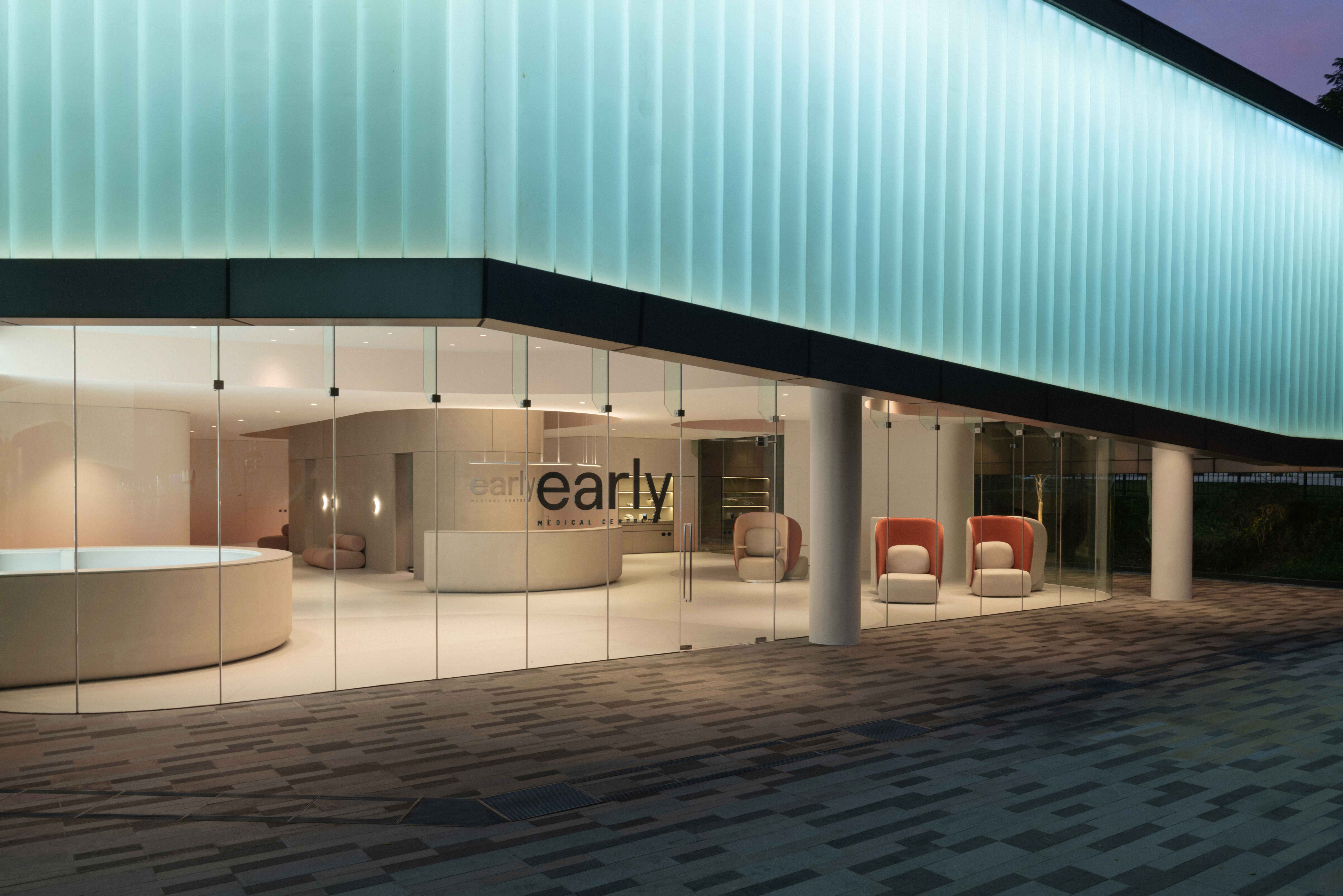
Behind an expansive glass façade, the walls and ceiling of early Medical Centre ebb and flow. Tones of peach, white, and light grey give the space a gentle character that runs counter to typical healthcare facilities. The atmosphere is safe and inviting, like a spa. Located at Science Park in Singapore, this is the first iteration of the new healthcare center conceived by MiRXES, a Singapore-headquartered biotechnology company established to promote a prevention-is-better-than-cure approach by intercepting diseases early with actionable and accessible diagnostics, made possible by advanced diagnostics technologies and innovative delivery platforms.
(Related: Steering the future of healthcare)
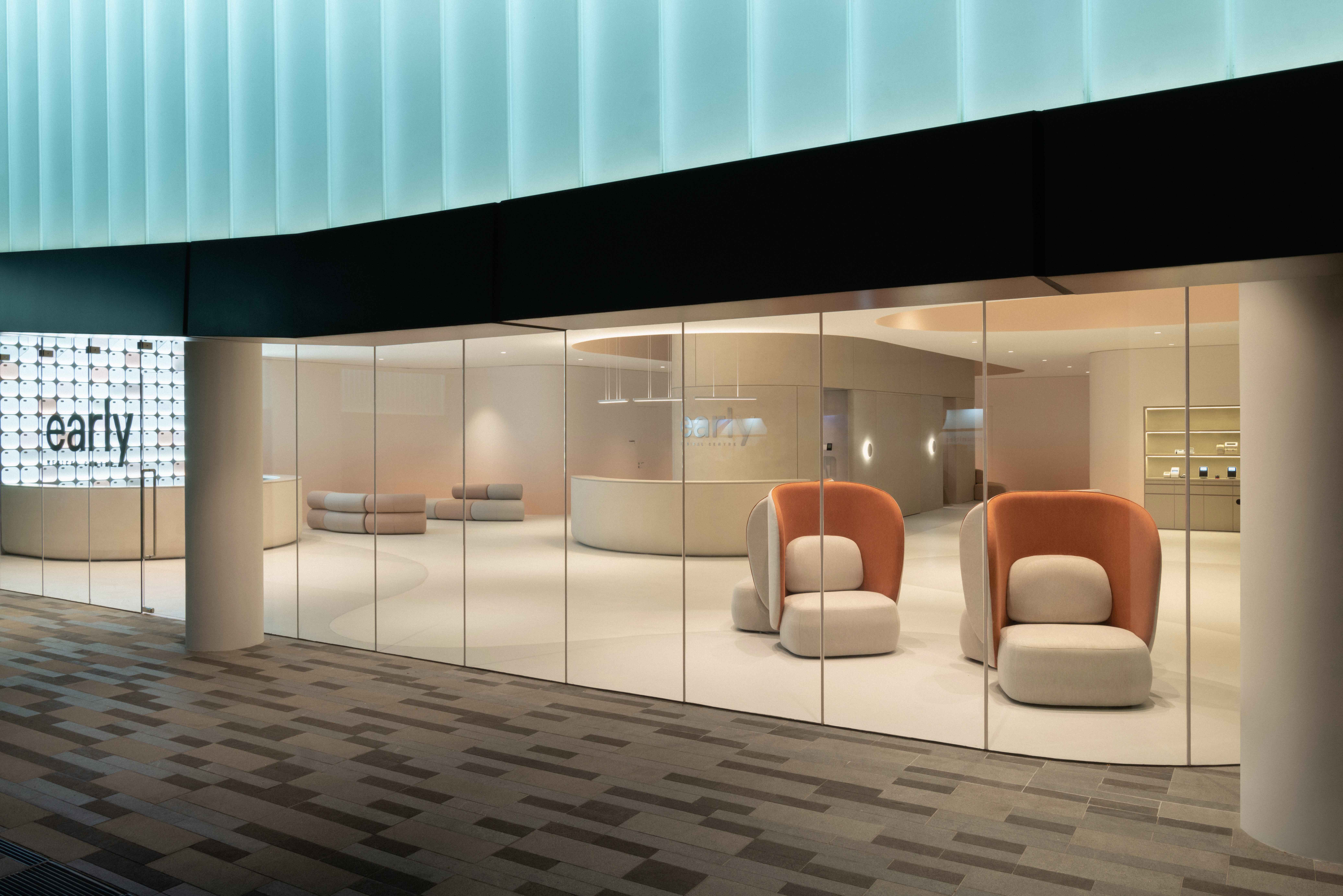
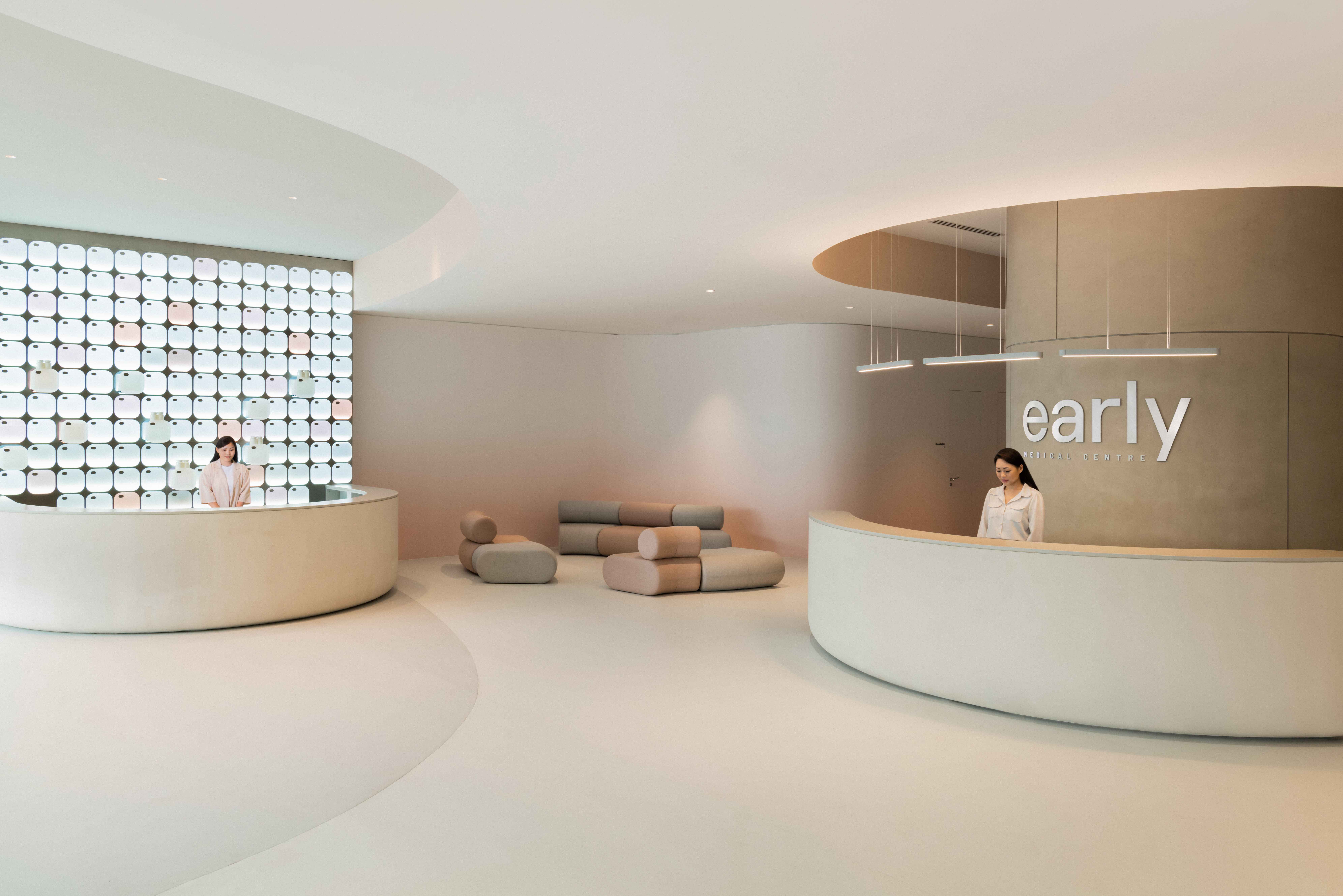
The interior is designed by Studio Antimatter, which is helmed by Gabriel Tan. Tan has had an illustrious design career, having designed products for international brands like Design Within Reach and Menu, as well as taking on the role of creative director to brands he helped found such as Japan-based furniture brand Ariake and Singapore-based hardware brand Turn Handles. He also founded product design company Origin, whose designs are made by artisans in Porto, Portugal where he is now based.
The design of early Medical Centre was a collaborative effort between designer and client; Tan even came up with the name of the facility. To bring about new developments in the design of healthcare spaces, an open-minded client is key. “Most healthcare providers in Southeast Asia are focused on maximising the per-square-foot usage of their space, which compromises on the customer experience. This often restricts workflow and limits new innovations happening in a space,” says Isaac Ho, the Chief Investment Officer of MiRXES. For this project, he wanted a more fluid space that allows the introduction of new concepts, products and has the malleability of quick space conversion whenever new partners come on board to promote health and healthy living.
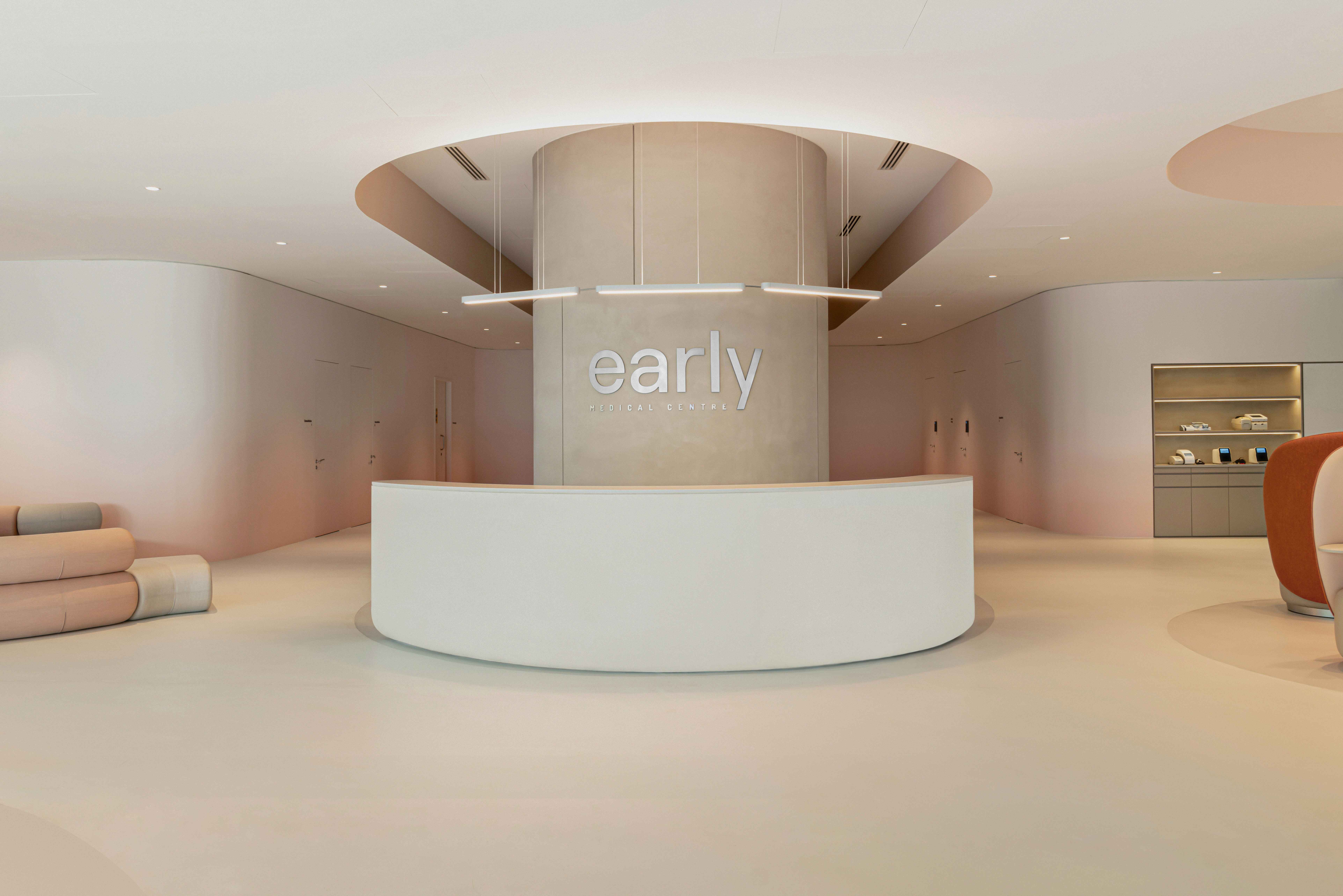
When one visits such a center to be checked, there is already fear and uncertainty. The design of the space can help alleviate that. “It is extremely important in healthcare to create efficient, seamless and painless, if not enjoyable interactions between humans, technology, and systems,” affirms Tan. “The starting point of the design was the synthesis of the client journey and the space. The journey is a discrete set of encounters, tests and consultations based in a sequence to reveal a client’s health baseline. The space was a vast, empty, rectangular unit with a large set of central structural columns,” he elaborates.
Embracing the situation, he designed the space for visitors to meander around the columns. To reduce claustrophobia and sterile corridors, as well as the fragmented spaces typical of medical facilities, Tan placed auxiliary functions around the central columns and medical programs along the periphery.
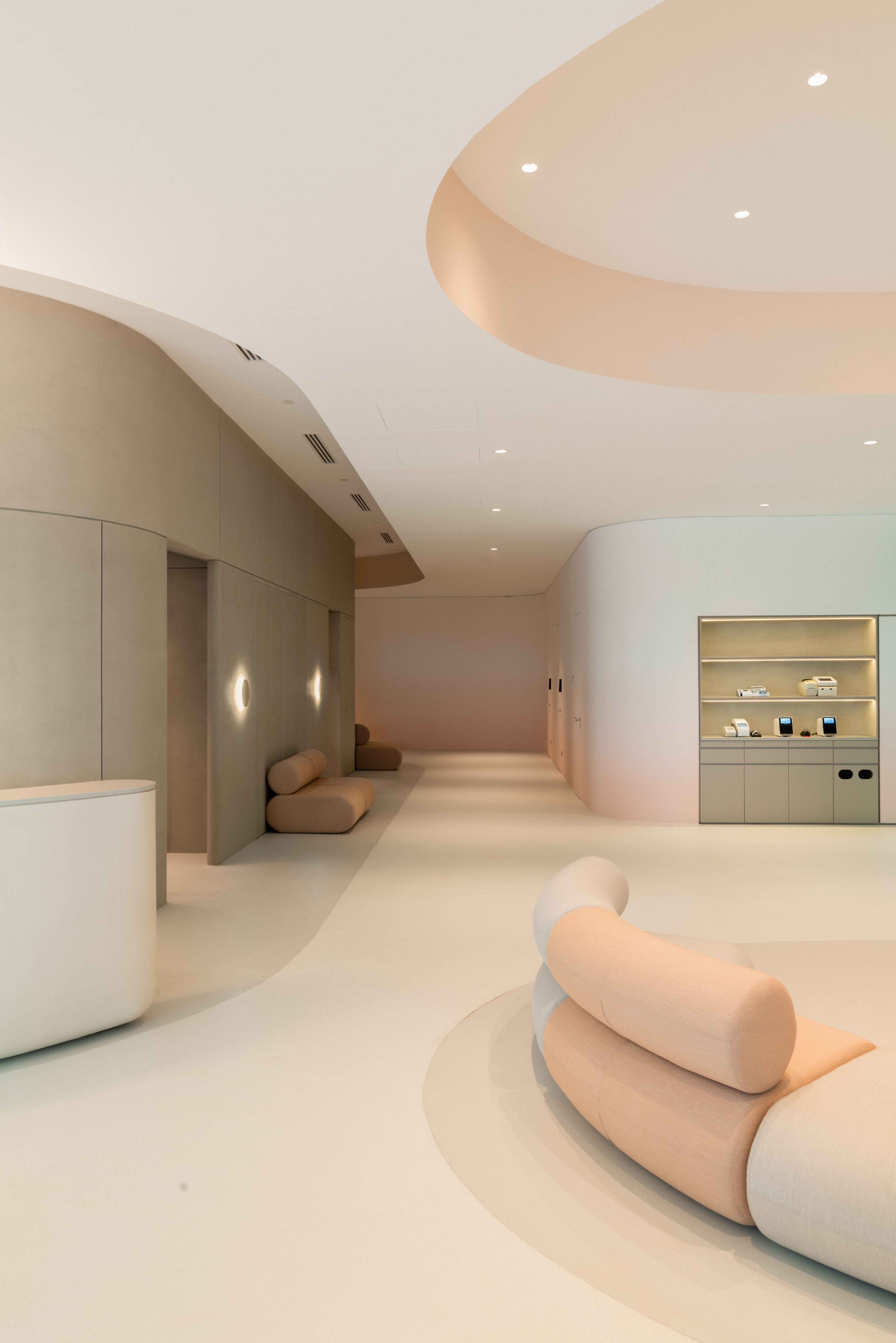
“The rounded corners and seamless surfaces complete this circulation. A gentle peach gradient climbs up the wall, evoking a sunrise and highlighting the smooth lines in the space,” describes Tan. The capsule shape – or obround – of the main column is repeated through the space at various scales for a consistent experience. Tan left the front half of the space open for flexible programming. Instead of dividers, cove ceilings, dynamic lighting, and way lines in the flooring demarcate programs – a method that is subtler and less disruptive. Inside the consultation rooms, a muted color combination and natural stone countertops offer a sense of calm.
The pharmacy counter pays homage to traditional Chinese medical hall cabinets with their multitude of small drawers in the form of a grid of lit drawers that rise to the ceiling. This reference is apt, considering how traditional Chinese medicine focuses on preventive rather than reactive treatments.
Tan’s industrial design background brings to the project a holistic approach. He also designed the furniture, which is meant to look nice as well as work more efficiently. “For each custom furniture, great care was taken to ensure proper ergonomics, hygiene and privacy while ensuring that they remain mobile and lightweight enough for easy reconfiguration,” he says.
One example is the phlebotomy chair that visitors sit on for blood-drawing procedures. Silicone leather upholstery is soft to the touch, but is non-porous and easy to wipe down. The general lounge seating are modular to aid easy reconfiguration while in the consultation rooms, the examination bed, designed together with healthcare professionals, is comprehensively detailed. It features in-built steps for ease of mounting and dismounting, and has a built-in tower paper dispenser, ample storage, and well-placed access to clinical tools and implements for the staff’s ease of use. The overall aim was to rethink how medical furniture can feel, look, and work.
There are plans to expand early Medical Centre to key cities in Southeast Asia. Positive visitor feedback during the soft launch phase has been encouraging. “Even in the preparation stage before the official launch, we have had prospects walking in to make enquiries. Our partners have also been very receptive in referring their own customers to the Centre,” says Ho.


.jpg&w=347&h=240&crop-to-fit)


 Back
Back
