Having lived in shophouses all his life, Mr. Fang Wei Low appreciates the soulfulness of their storied bones, and he believes there are others like him. Hence, he established Figment in June 2019, a boutique coliving company specializing in historic properties.
Yet, simply providing the spaces was insufficient; Mr. Low sought provocation and engagement. In the spirit of creative exploration, he introduced Case Study Homes by Figment in March 2020, giving carte blanche to three Singaporean design studios in dressing three shophouses.
The initiative ideates from the Los Angeles Case Study Houses, designed by architects such as Eero Saarinen and Richard Neutra for Arts & Architecture magazine’s response to America’s post-war housing boom.
The Lorong 24A Shophouse Series unveiled in 2012 by Mr. Low’s father, lawyer Low Seow Juan, is another precedent. The latter project saw seven local architects refashion the interiors of a row of shophouses, several of which now come under the Figment fold. We delve further into Case Study Homes’ three designs.
- MINISTRY OF DESIGN FOR CANVAS HOUSE
- SCENE SHANG FOR SHANG HOUSE
- STUDIO JUJU FOR STILL HOUSE
Would you allow the literal erasure of your childhood links for art’s sake? Mr. Low did, by letting Ministry of Design (MOD) bleach white the entire interiors of his Blair Road childhood home.
Architectural purists might shudder, but the idea is to eradicate any preconceived notions of shophouse living so tenants can layer on their domestic visions, says MOD’s founder, Mr. Colin Seah.
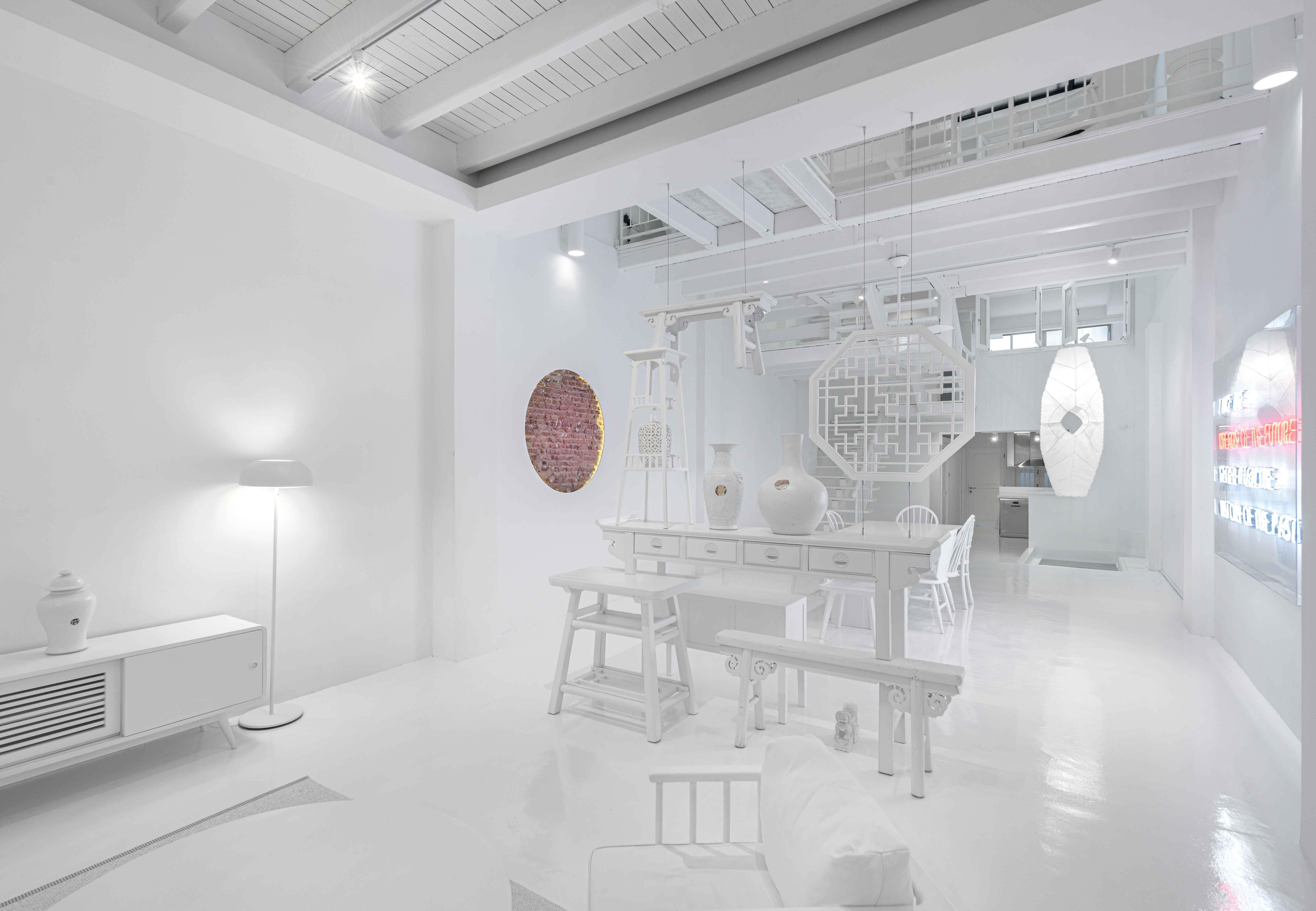 The living room in Canvas House at 28 Blair Road
The backdrop sees heritage play peek-a-boo through unpainted timber floor parts shaped like cast shadows and exposed circular brick wall fragments. In the dining area, a neon inscription of a Thomas Jefferson quote reiterates the theme of time while local artist theKANG’s fused cling wrap luminaires and the second-hand alabaster-coated furniture propagate the upcycling doctrine.
The all-white canvas has an art gallery feel, where there’s a sudden heightened awareness of the space.
Mr. Colin Seah (CS): But unlike an art gallery it’s not completely neutral, because it’s stylized. The color is not the key thing. If it were just a pure white space without any furniture, the project would be a failure, because then it would not have the reading of object and space, and the notion of time layered over. It will not appeal to just anybody, and it’s not meant to.
Can you highlight the complexities of creating an all- white environment?
CS: The color was chosen because of the association of a canvas, but white is not necessarily the most forgiving color. And then there’s paint that’s suitable for timber, paint that’s suitable for plaster walls, and paint that’s suitable for metal. It got even more challenging where we chose to expose parts of the heavily textured cases or art pieces.
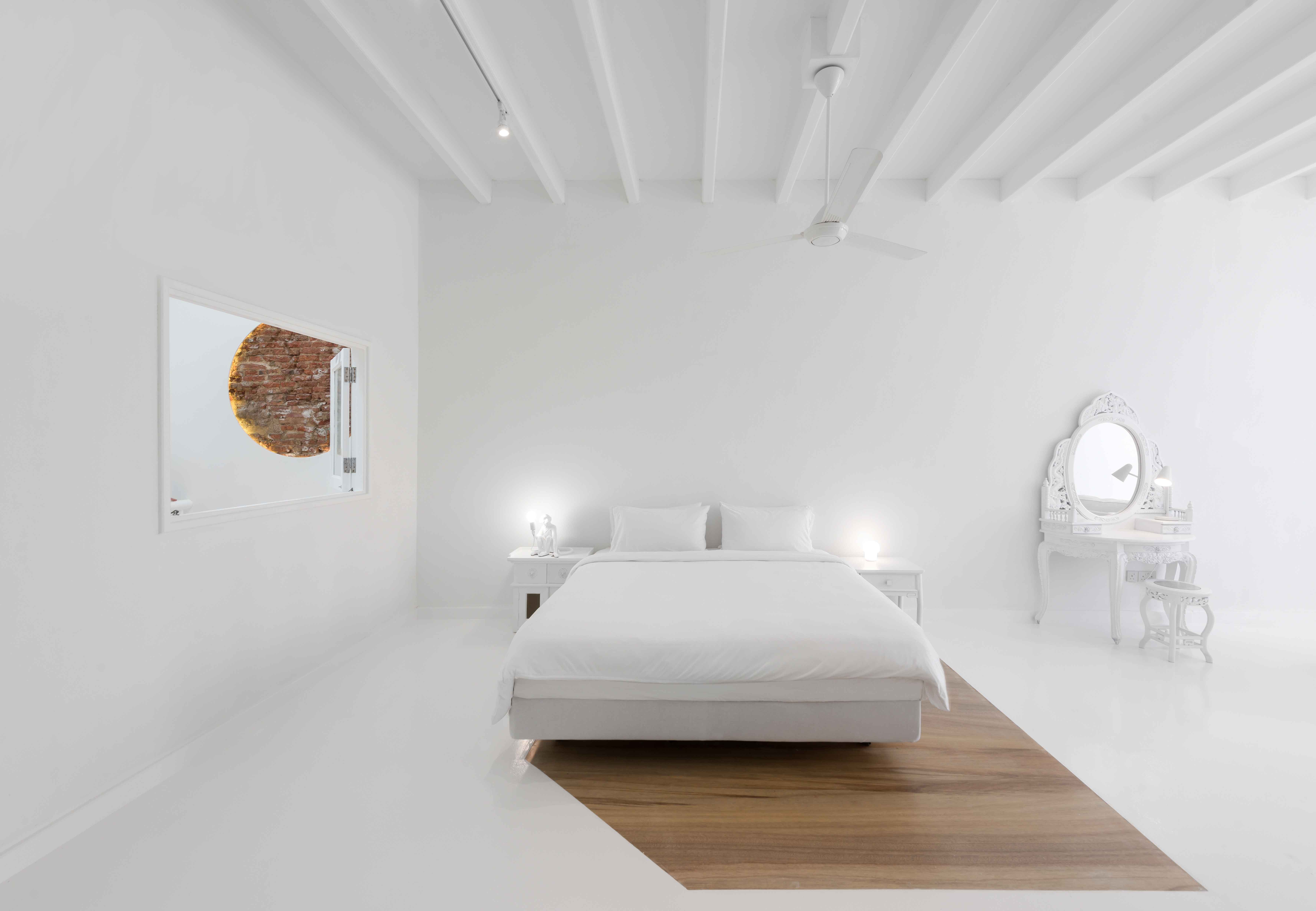 The Alabaster Suite
How do the realms of art and domestic space attempt to dialogue here? For example, the assemblage of objects in the living area could be read as both a space-dividing device and a sculpture.
CS: There is art that is very obvious, like paintings or sculptures, and there’s art as a thought. I think the notion of art here is somewhere in the middle. [The objects] border on usability, yet are they meant to be used?
There’s that kind of question mark. It was more an artistic endeavor; the creation of a stage set as if they are frozen in time. The whiteness allows us to disassociate the physical associations of these pieces of furniture, to see them in a new way.
- MINISTRY OF DESIGN FOR CANVAS HOUSE
- SCENE SHANG FOR SHANG HOUSE
- STUDIO JUJU FOR STILL HOUSE
Scene Shang for Shang House
When Scene Shang’s founders entered this shophouse in Pegu Road, they knew immediately that their furniture would fit right in. The combination of a timber fenestration-gridded historic façade and modern interior elements, such as glass brick walls and a floating timber staircase, echo the furniture brand’s old-meets-new ethos.
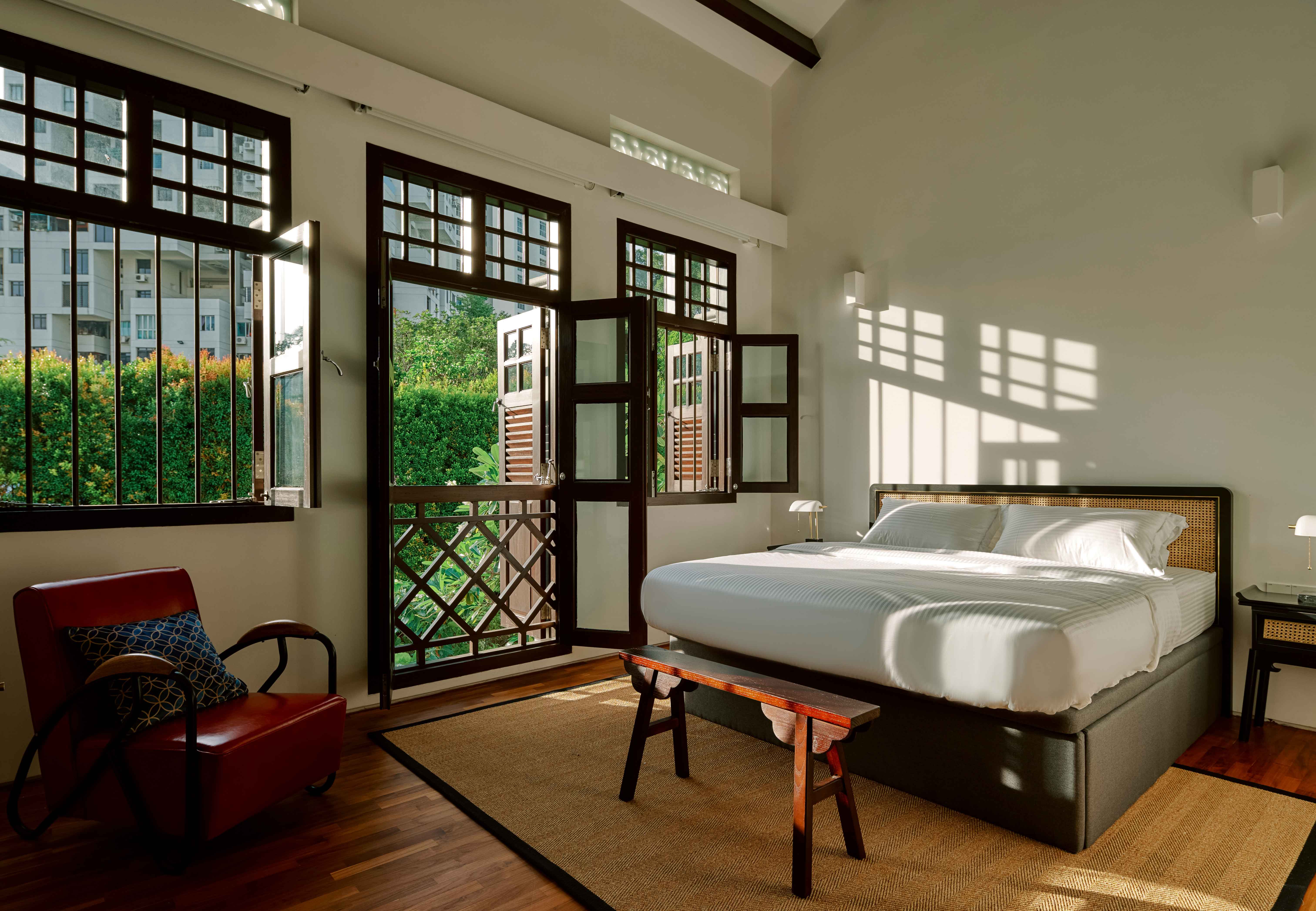 The bedroom in Scene Shang for Shang House at 10 Pegu Road
Rattan-finished Scene Shang pieces in the restored pre-war shophouse reference the Balestier conservation area’s former rattan industries. Tenants can bring a piece of Shang House with them after leaving by ordering any of the furniture items through QR codes tagged on them. Designer Ms. Jessica Wong elaborates.
How does the Shang House reflect your ideas of home?
Ms. Jessica Wong (JW): Home is where you need to both feel comfortable and be inspired, because you are going to spend every day here. This space appeals to people who [like subtle] tactile qualities, and who love history and culture but don’t want to live in an antique museum.
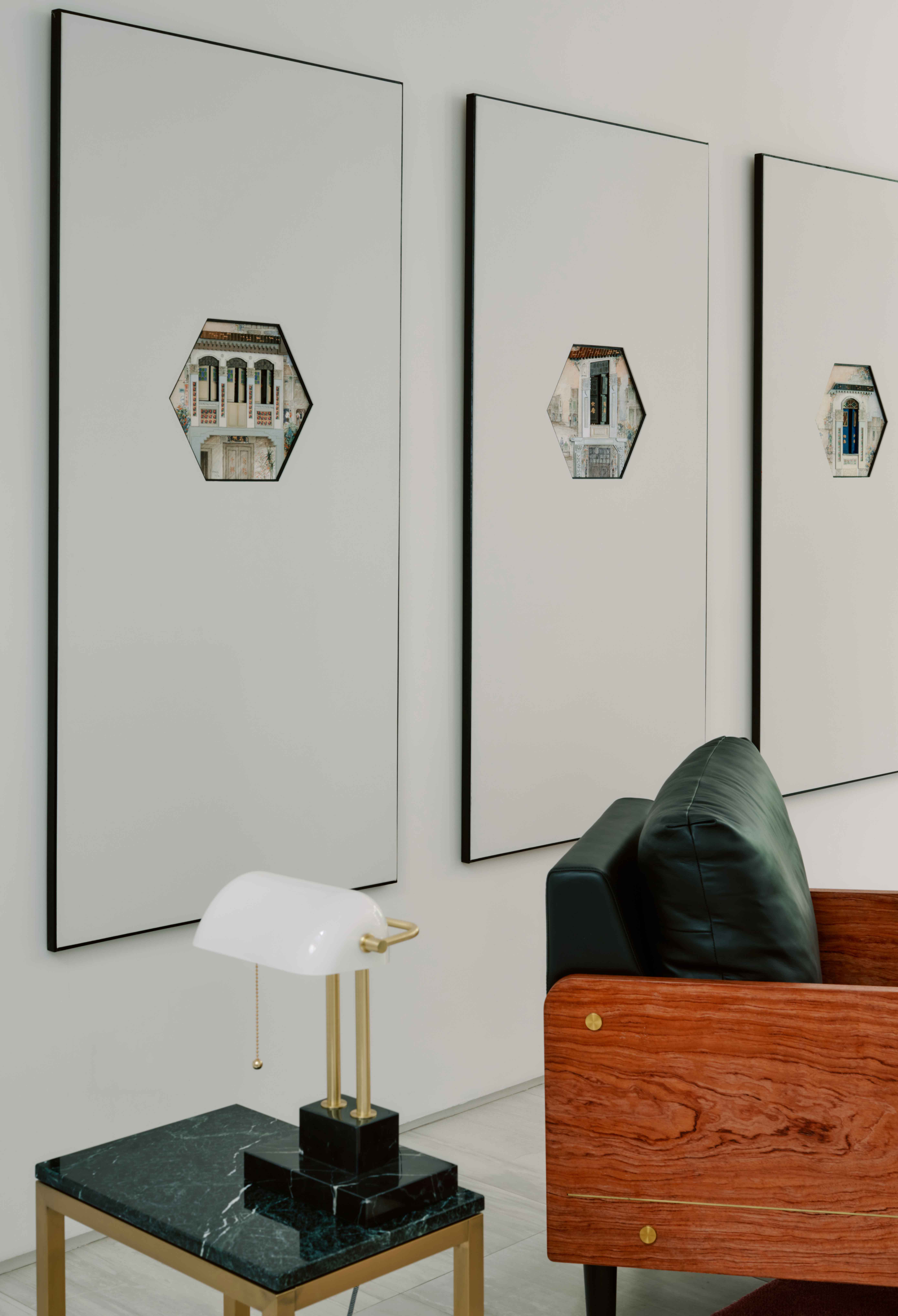
Several individuals will live here. How do your designs cater for that scenario, addressing issues of privacy and communality, or identity and neutrality?
JW: The modular Shang system can be reconfigured as tenants’ needs change. It was inspired by traditional Ming Dynasty furniture but [its adaptability] is a contemporary touch.
We also designed a large, square dining table that fits into coliving scenarios; you can still see others across the table but have privacy if you sit at separate corners. We imagined it not only as a dining table, as some tenants might come down [from their rooms] to work.
Scene Shang has a distinct aesthetic direction. How do you prevent yourself from being stuck in a certain trajectory?
JW: When we started Scene Shang, we thought that [the body of cultural references] is so rich we will never run out of new ideas. But sometimes, there can be stagnation.
That’s why we work with collaborators such as Larry Peh, who gave the Shang system a completely different outlook with acrylic. Another way would be working with clients like Mr. Low, where we design and customize [pieces] we never thought of doing.
- MINISTRY OF DESIGN FOR CANVAS HOUSE
- SCENE SHANG FOR SHANG HOUSE
- STUDIO JUJU FOR STILL HOUSE
Studio Juju for Still House
Along Koon Seng Road in Singapore’s Joo Chiat vicinity stands a row of conserved Peranakan shophouses whose pretty pastel shades often pause footfall.
In a soft pink one, Studio Juju has created four youthful yet homely suites. Distilled forms contribute to a general calm, while tasteful furniture — some customized — addresses functionality in a lively manner.
 Studio Juju for Still House at 15 Koon Seng Road
Among them are an anthropomorphic Magis armchair, Vitra Uten.Silo wall organizers, and glossy Serex ceramic nightstands. In the backyard, an amorphous Bonos outdoor bench from Qeeboo draws conversation outdoors.
Co-founder Mr. Timo Wong reveals a formula encompassing “an assemblage of well-designed functional elements, some color, some warmth, some whimsy and some light- heartedness.”
How does your design strategy consider the motley requirements of different tenants?
Mr. Timo Wong (TW): The suites are designed to be of various sizes and functionalities. We made all of them different in terms of their key features, such as a suite with a bigger study and living room for people who work from home, and a suite with a large, sunken living area for occupants who like to lounge freely.
Can you explain the design of your custom pieces for Still House?
TW: We like the idea of affordance. In this case, it translates into literal physical characteristics of the dining table and bed frames. They communicate strength and durability to cater for any private or communal activity.
We also designed wall ledges in the suites for novels, clocks and other accessories, assembled in various compositions in each suite. The design allows a flexible, non- conforming way of organization and personalization.
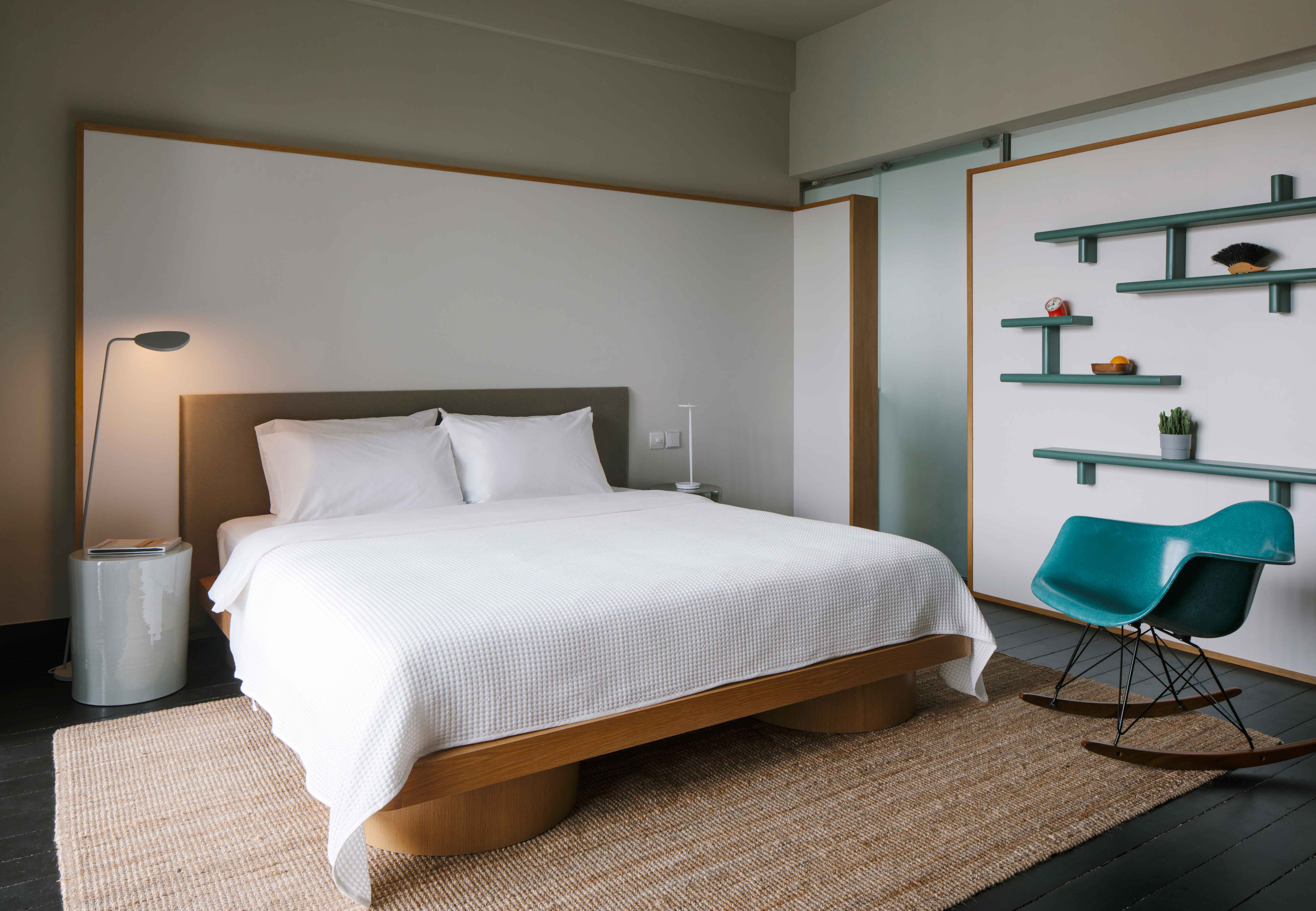
Color is a notable protagonist in the Still House. What is its role here?
TW: The colors of the doors to the suites and rooms, as well as the colors and finishes of the furniture, all come together to lead you from one touch point onto another in an almost rhythmic [fashion]. They don’t necessarily relate to the heritage of the building.
The Enzo Mari prints were a personal [preference]. The fundamentals of how we appreciate beauty starts with simple daily objects and nature, understanding their outlines and being moved by their colors.


.jpg&w=347&h=240&crop-to-fit)


 Back
Back