The route to Pangium comprises a long drive down a road bordered by verdant foliage. Located in The Orangery, a bulbous building with full-height glazing looking out to greenery, the restaurant is part of the Singapore Botanic Gardens’ Gallop Extension. Pangium is chef Malcolm Lee’s newest project after his first restaurant – the popular Michelin-starred Candlenut at COMO Dempsey. It thrives on inventiveness – think temoyak (a whole patin or catfish) cooked with Mao Shan Wang durian flesh fermented with sea salt or buah keluak sambal with oxtail and serunding daging (beef floss with roasted coconut). The restaurant is named for the pangium edule tree that grows from the buah keluak seed – Lee’s favourite ingredient. The restaurant environment was designed by Singaporean design practice Lekker, which was founded by husband-and-wife duo Joshua Comaroff and Ong Ker Shing.
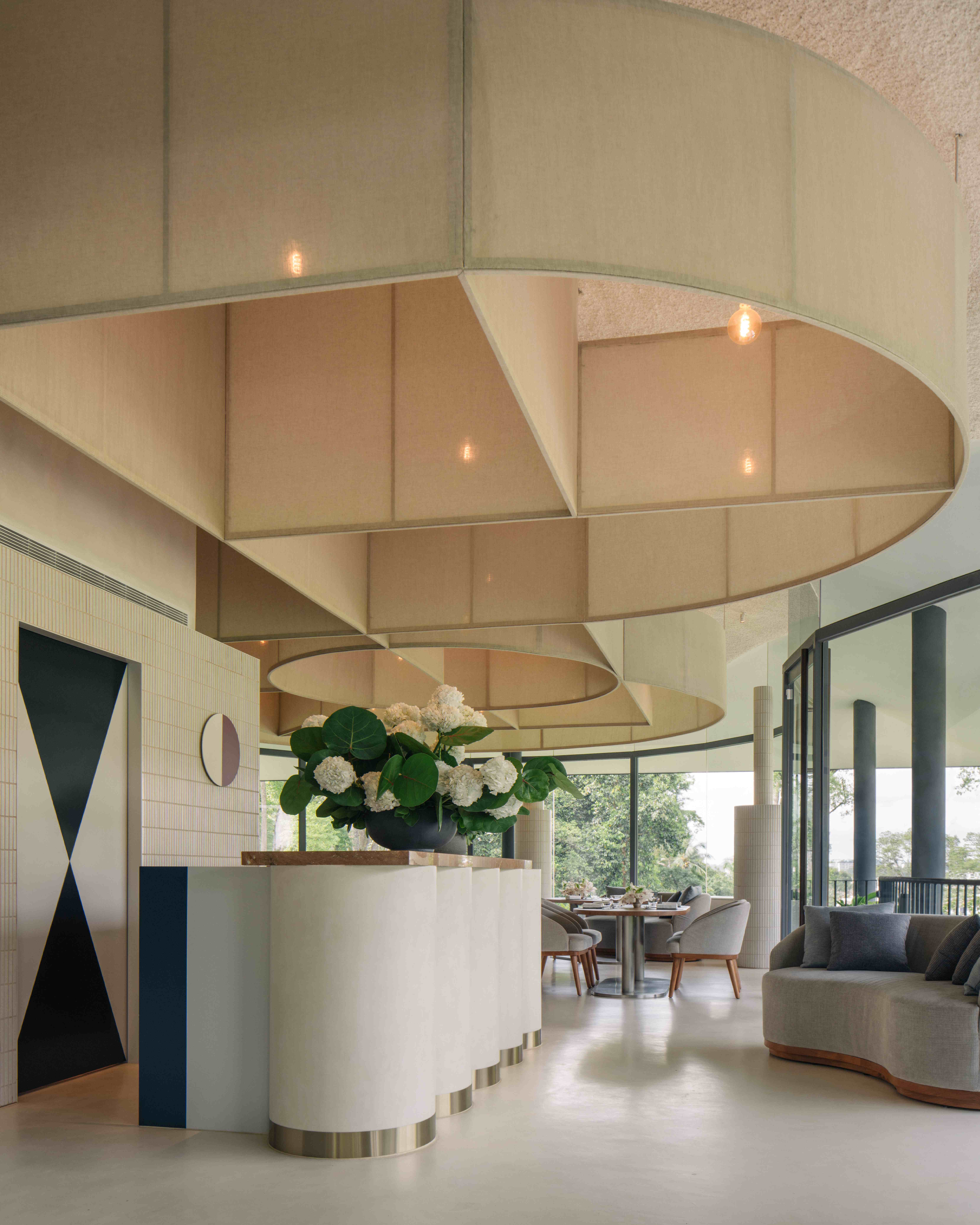
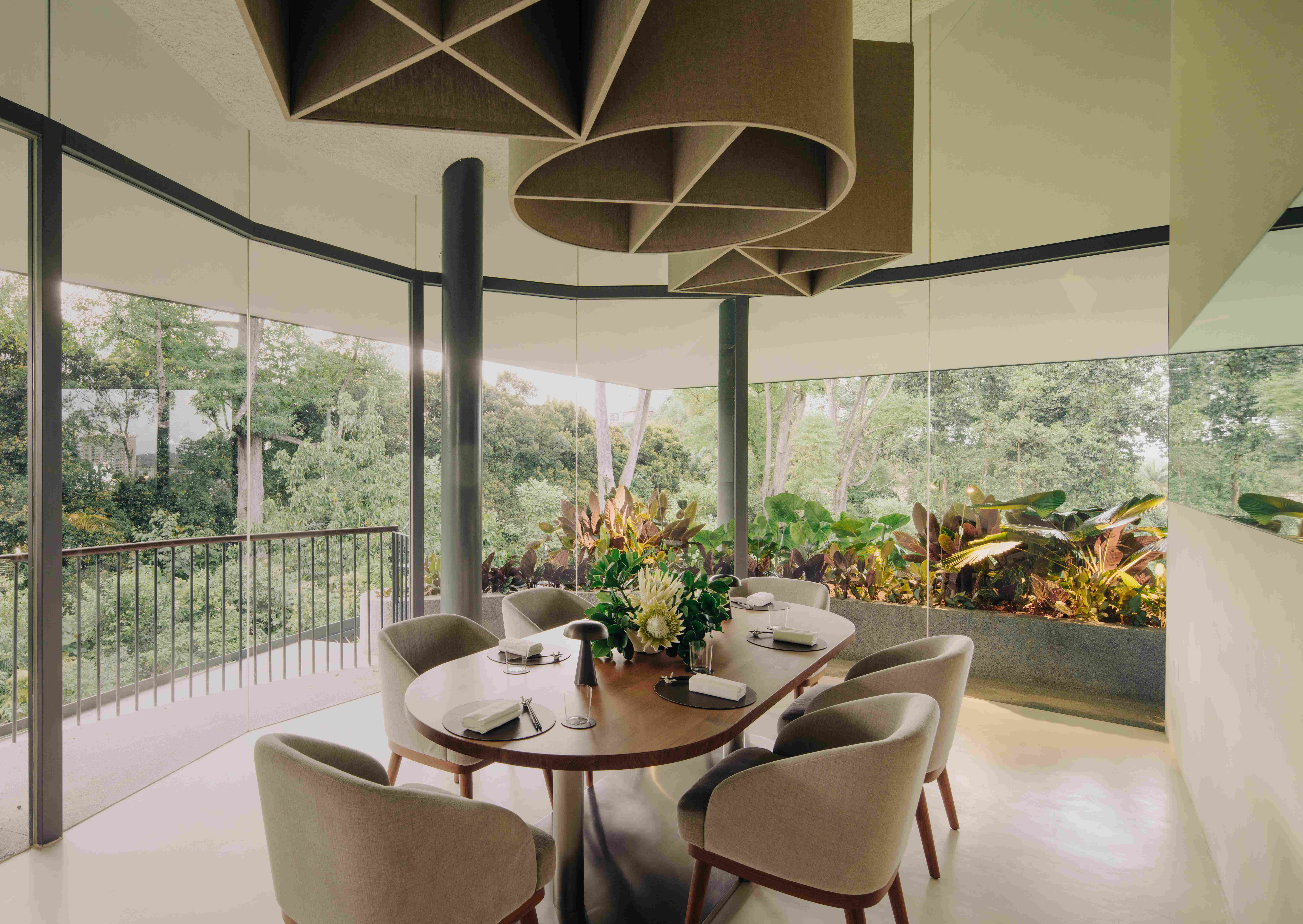
“Pangium was a compelling problem, given that Candlenut is already a famous and beloved restaurant, with a very clear design language of its own, which draws on the vibrancy and colors of Peranakan patterns and fabrics. It was important for Pangium to have its own identity, but not be something alien either,” says Ong. The design centers on geometry drawn from Peranakan historic aesthetic found in architecture or clothing, such as the kebaya. The highlight is a geometric cloth ceiling inspired by the construction of rudimentary box kites made by children. It floats above a “zen-like” palette of tiles, micro-cement flooring, and wooden elements, whose neutrality was deliberate to let the greenery outside the window become the focus.
Pangium’s design represents the practice’s current direction, which has evolved from a more traditional architectural approach of a preoccupation with volumes, structural language, and materiality into one that is people-centric. This shift was guided by the practice’s increasingly inter-disciplinary aspect, as well as new insights gleaned from Comaroff’s pursuit of a PhD in social science. “We became much less interested in the building, and more in what happens in there, in human terms. What kinds of interactions and experiences were we enabling, or working against? How could we do more of the former and less of the latter,” the team questioned.
Regarding Pangium, the first step was to zoom in on the guest experience. “What will the dishes look like? What is their timing? What will the light be like and how will the sound of the room either help or distract from the food? We were thinking of this space not as a ‘design’ so much as a kind of staging – a theater for eating. Malcolm’s vision for Pangium struck us as very focused. You need to pay attention to it. It has a small scale, with intricate components,” expounds Comaroff.
The final design has an intentionality and relevance akin to the design of high-end Japanese restaurants, Comaroff points out. Likewise for the redesign of Cocoa Island in the Maldives for the COMO Group, there is an attentiveness that is purposeful and ritualistic. “Everything at Cocoa underwent an intensive sensory imagining and designing – from the rooms, to the dining and toilets. Again, the role of our work was much more stagecraft,” says Comaroff.
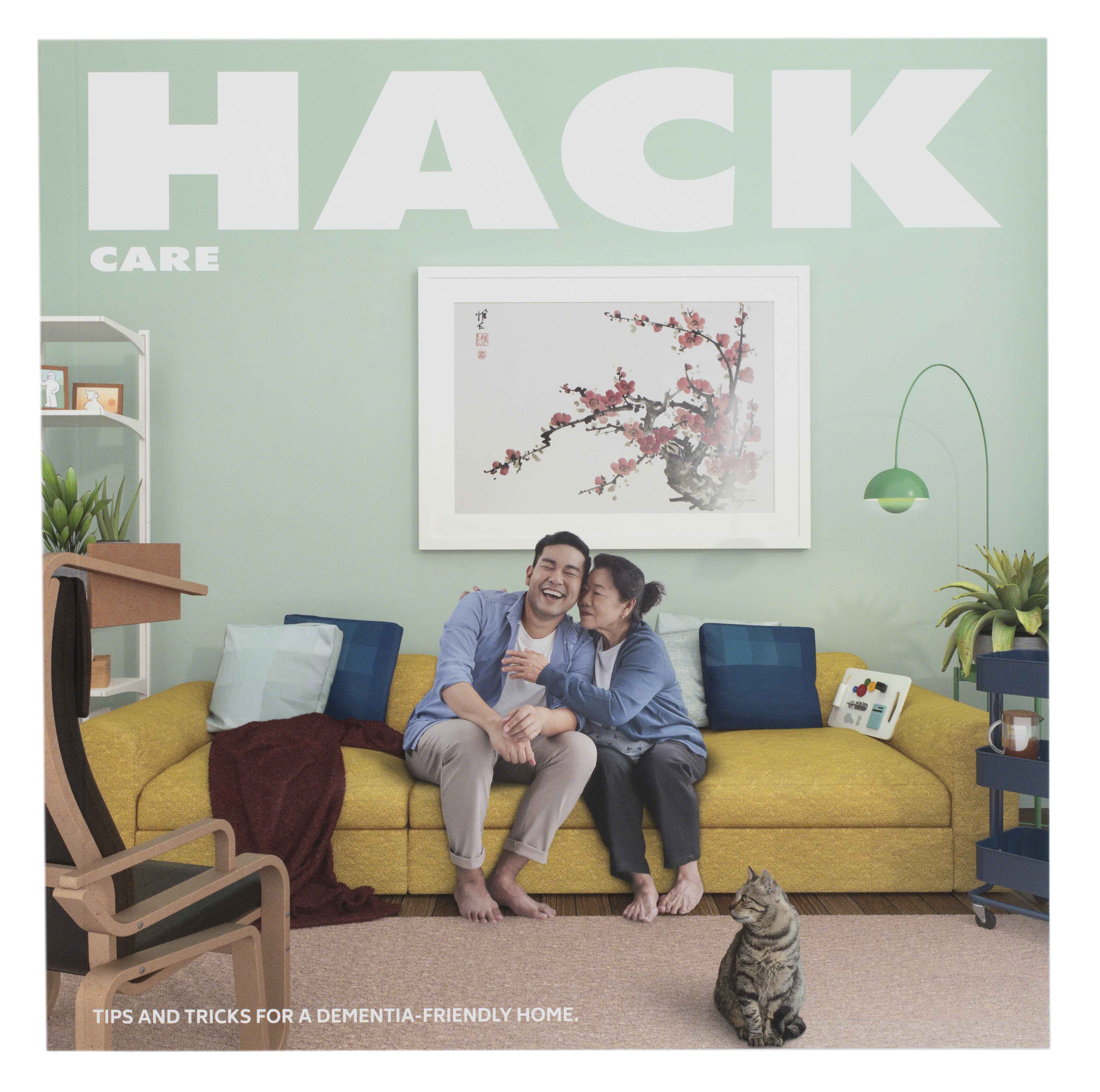
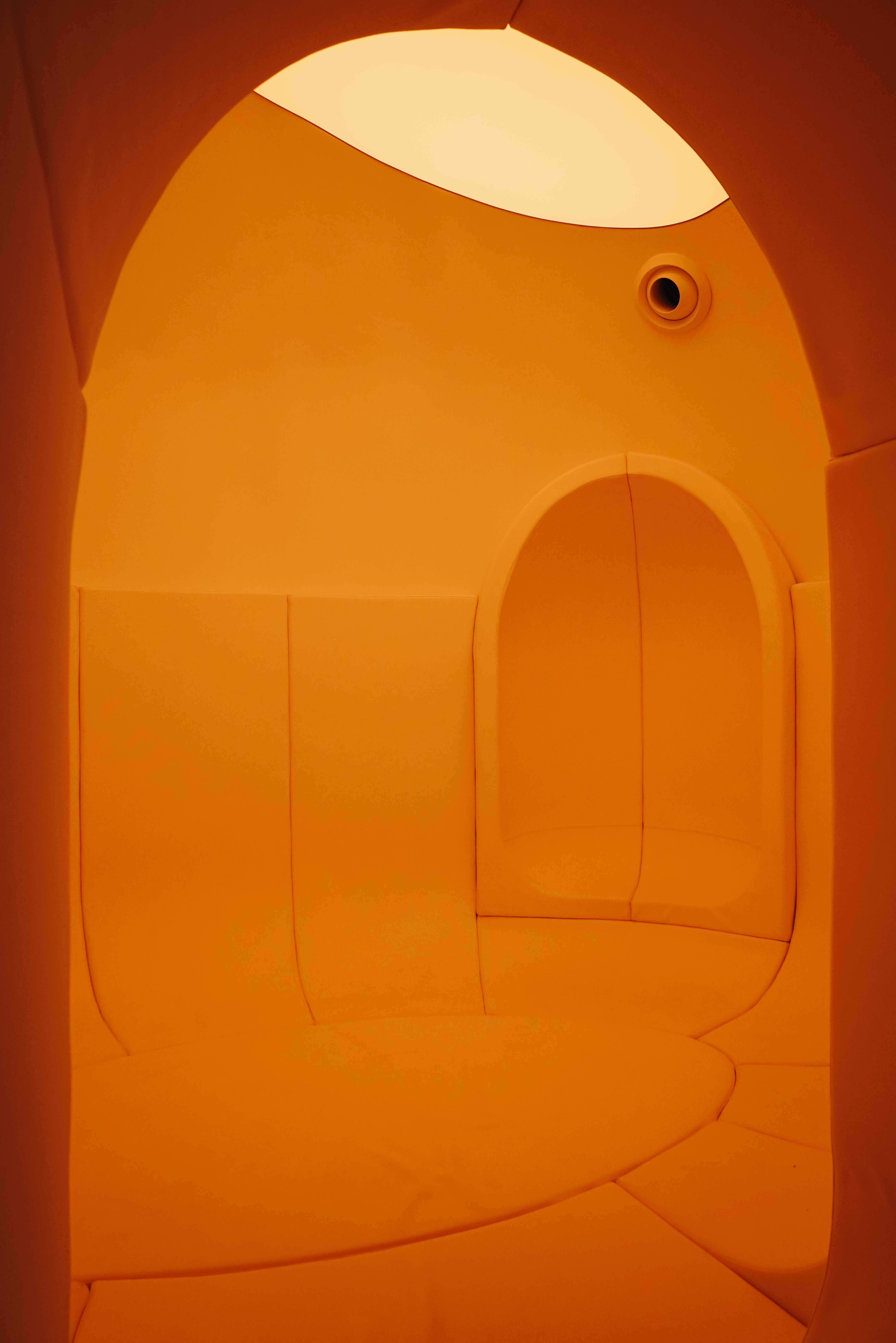
While the hospitality sector offers rich grounds for experimentation, it is perhaps the less glamorous fields that the practice’s approach benefits users most. Lekker designed the first Quiet Room for the National Museum of Singapore – a calm space within the building for visitors who have neuro-diversity and hypersensitivity issues – and is working on the new Quiet Room in the Garage Museum in Moscow by Japanese architecture firm SANAA. There is also Kindle Garden, which is Singapore’s first inclusive pre-school that accepts both typically developing children and those with special needs. Last year, together with design studio Lanzavecchia + Wai, the practice conceived Hack Care, a book project initiated by the Lien Foundation featuring over 50 simple tricks to make common furniture more comfortable, easy to use or approachable for patients living at home with dementia, as well as for their carers.
(Related: A space for better mind and body)
“Our projects of recent years have a heavy social emphasis, with a big methodological push into design research to guide our decisions. We have been fascinated by the kinds of projects that many firms avoid – design for dementia care, for young children, for neuro-divergent occupants and clients, for hospices, and isolated elderly. We don't see traditionally marginalized clients as distinct from sophisticated luxury consumers, because the common denominator is the importance of social and experiential factors in the ability to enjoy a work of design. Folks with hyper-sensitivity and fussy upper-end consumers are both extremely attuned to their environments,” comments Comaroff. “As a result, architecture is not really the end product for us; it is simply a medium, and the end products are social outcomes, interactions and possibilities.”


 The bottom of the geometric cloth ceiling at Pangium ends at the top of the windows to focus the views on the lush greenery outside.
 The geometric design of Pangium's textile ceiling was inspired by Peranakan historical aesthetic, such as ornaments in Straits architecture or in a kebaya.
 The 240-page Hack Care guide is playfully styled like an IKEA catalogue with an easy-to-understand format of showcasing how to care better for persons with dementia.
 The womb-like Quiet Room in the National Museum of Singapore, which is dampened from vibrations and most ambient noise, represents a new direction in inclusiveness for public museums.


 Back
Back