This is one example of a unique and considered approach to office design by the Liechtenstein-founded private bank that seeks to bring about a new way of engaging clients, visitors, and fellow bankers. The office is in the new Guoco Midtown development, where the bustle of the streets below contrasts with the calm that the office interior emanates.
In VP Bank’s new office space in Singapore, there is a special meeting room designed like a tea room. The solid walnut table with organic edges is inlaid with a brass panel that contains a trough for tea ceremonies. Classic black Carl Hansen & Søn Wishbone chairs, a light pendant – slim as a sheet of paper and translucent like a lantern – as well as hanging shelves displaying delicate tea ware complete the composition of homeliness and artfulness.
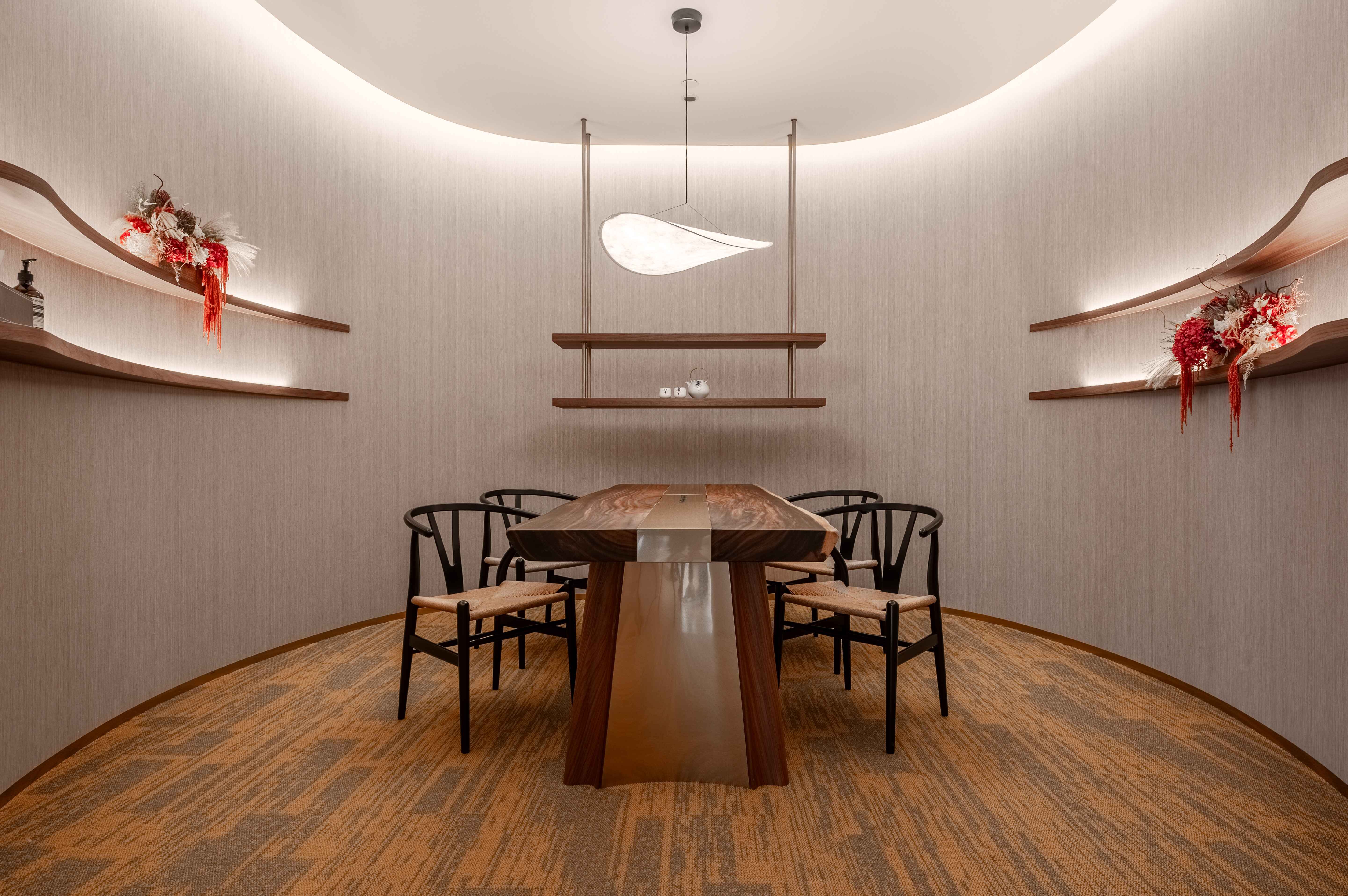 A meeting room in VP Bank's Singapore office designed like a tea room.
The space was designed by Hong Kong-based LAAB Architect’s design director Otto Ng in collaboration with Heline Lam, VP Bank’s chief of staff Asia and managing director. It was realised in partnership with Singapore-based design studio Monocot and construction company Justbuild. Offering professional and personalized banking services to intermediaries and private banking, the new office design prioritizes comfort and a sense of ease as investment discussions takes place.
The feeling of a ‘banking sanctuary’ is felt immediately upon arrival, with potted plants that accentuates the tropical locale. Behind the reception counter, subtle swirls of textured paint in earth tones echo the curvilinear walls that lead visitors into a capacious lounge area. Timber walls lend warmth and soft upholstery a sense of welcome. The staff area, contained in another wing, has an open plan that maximizes natural light and a positive working environment.
(Related: Primed for Passion)
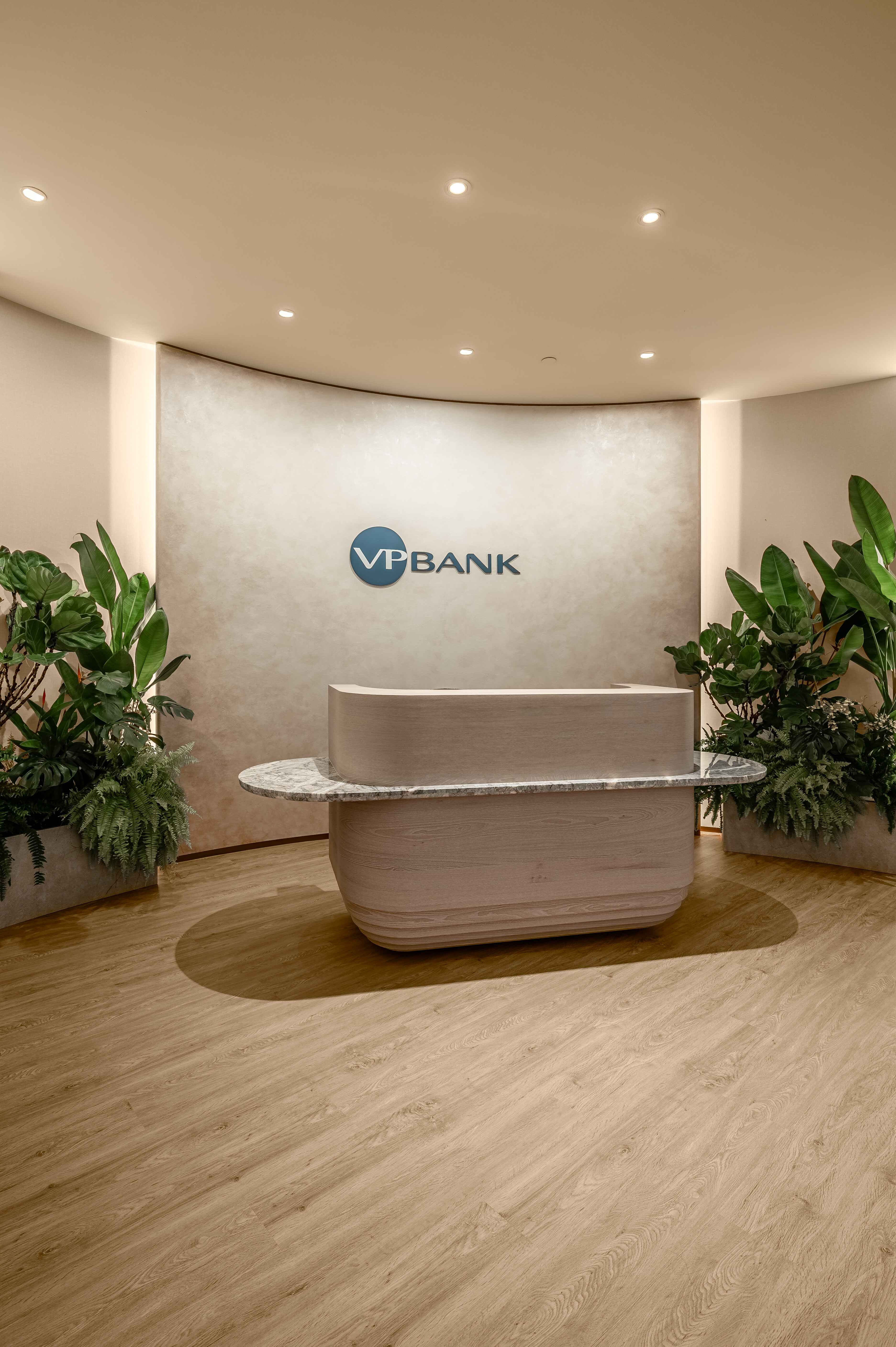 The curves in the interior design project an approachable image, as well as leads visitors through the spaces in a fluid manner.
“The textured paint required the painter to meticulously paint stroke by stoke. It gives visitors a sense of the human touch because the art is in the strokes. It’s almost like a large acrylic painting. All of these details – the natural materials, the textured paint, and the greenery added by Heline herself – formulate a softer experience in the bank,” highlights Ng.
This is the second collaboration between the duo, with the first being the Hong Kong office. “We are very attuned with what VP Bank’s brand is about now. In terms of the feel and look in Asia, we discussed that we didn’t want clients to feel like they are walking into a traditional banking space. We wanted them to experience the warmth of the human experience,” says Ng.
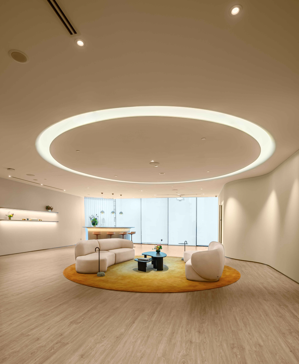 At the heart of VP Bank's Singapore office is the 'living room' - a lounge designed for comfortable social interaction and events.
The curves are also part of the corporate image, modelled after the ‘imperfect circle’ in the logo. “For example, the curved walls create a fluid experience so clients always feel comfortable moving through the office,” says Lam. The lounge seating, greened by plants, is set in an oval configuration. A bright tangerine carpet mirrors the bespoke oval cove lighting in the ceiling, whose smooth edges add to the space’s quiet sense of composure. In a corner, a curved bar counter facilitates social events and larger-scale meetings.
The highlight at the end of the lounge is a wall of windows with panoramic vistas. The natural daylight that washes through is calming, invigorating, and in line with biophilic design principles.
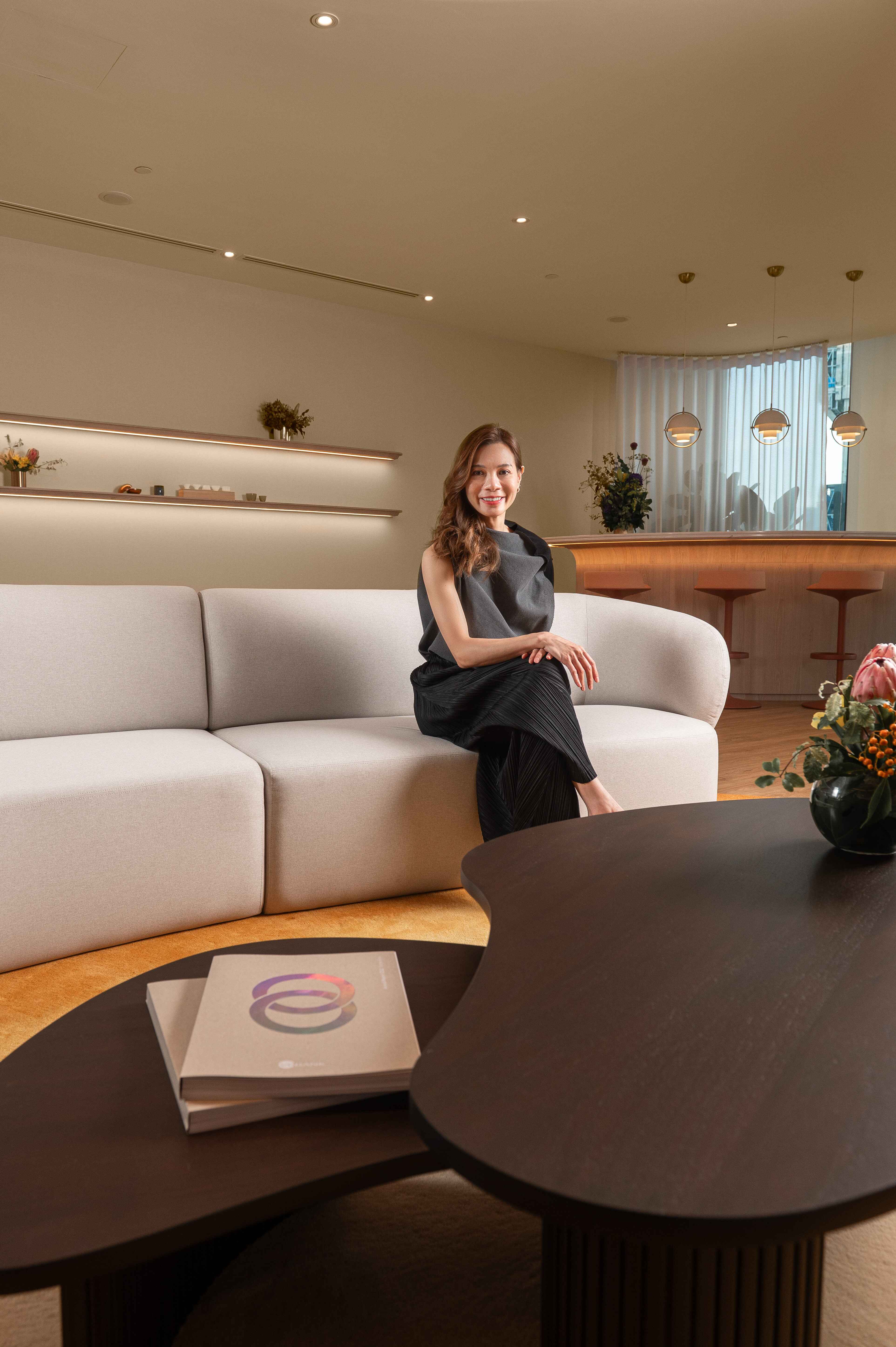


Surrounding the lounge are several meeting rooms, each named after different VP Bank locations, and with varied interior designs. The aforementioned Hong Kong Room with the tea table is one. Lam shares that there is also a similar meeting room in the Hong Kong office. It emblemises Asian culture, rooting the offices in context. “This room definitely feels oriental. You know that you are in Asia,” she remarks.
Comments Ng, “Conventionally, you require a television, a table, and a few chairs. But we think that the definition of a meeting room can be interpreted in different ways. We tried to make the rooms comfortable and inspirational. For example, the different names and types mean that every time a client comes, they can go to a different room, giving them a sense of discovery.”
In another meeting room, lounge chairs with colorful upholstery are grouped in the center, leaving space around for users to stand up or walk about during discussions. “Clients like it because they can engage in conversations more freely and openly,” observes Lam.
Throughout the office, the attention to detail is palpable, even down to the temperature of the ambient lighting and bespoke curved door handles designed by Ng. “You can sense the intention of the details, just like how VP Bank conducts their business; it is detail oriented. I think being detailed is very important for banking because it gives clients a sense of security and confidence in [the institution],” says Ng.
The interior design seeks to bring back face-to-face interactions that were missed during the pandemic. While online meetings mean that the current meeting room set up now includes the provision of quality lighting, acoustical considerations, and backdrops catering to video calls and conferences, there was also a need to create welcoming and comfortable spaces that clients, or even staff, would want to physically gather in.
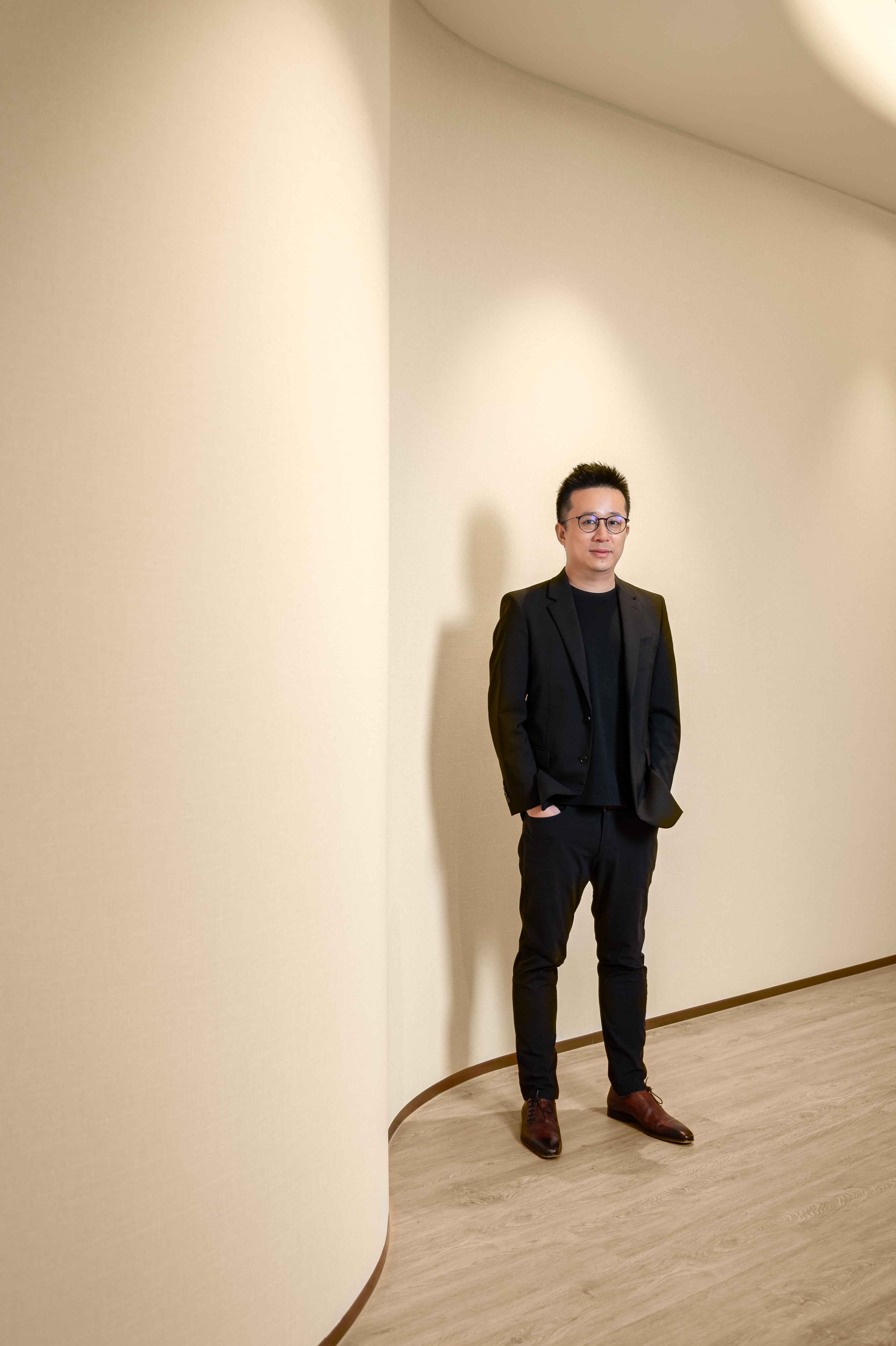


“We had designed the Hong Kong office during the pandemic. The Singapore office is an evolution of how we understand space; how people work and talk to one another post-Covid. We wanted to create interactive spaces for people to meet in person again, especially people who have not met in person for a very long time, or have never seen each other in person,” observes Ng on the homey, hospitality-focused interior design.
The soft color palette, accented by a few brighter pieces, perpetuates the calming atmosphere. The shades were chosen from VP Bank’s generous brand colour palette, which offer many secondary colours aside the main cobalt defining the logo. “A lot of our banking contemporaries stick to very defined colours. VP Bank has a wider spectrum to choose from that allows for more [inclusivity] and warmth; you don't feel so segregated,” remarks Lam.
The new office is timely to celebrate VP Bank’s 15-year presence in Singapore. The office is a conversation starter for visitors, which Lam is pleased with. “Many clients, who have visited banks all over the world, have commented that this office is unique. They enjoy sitting and engaging in the spaces, feeling very comfortable here. That is exactly the feeling we wanted to emanate.”


.jpg&w=347&h=240&crop-to-fit)


 Back
Back
