Mr. Roy Teo climbs through a window from a ledge done up to resemble a balcony, but the heel of his shoe catches on the window frame. There’s a moment’s struggle, but after a frightful pause, he steps back into the safety of one of the units within The Mill, the building that’s home to the design firms he established.
Is this the most outrageous thing you’ve done for a shoot, we ask.
“No, but it’s the most dangerous,” he replies.
But the dramatic photo this tricky maneuver generated is a sight to behold: Mr. Teo resembles a lord overlooking his dominion. And The Mill is his castle.
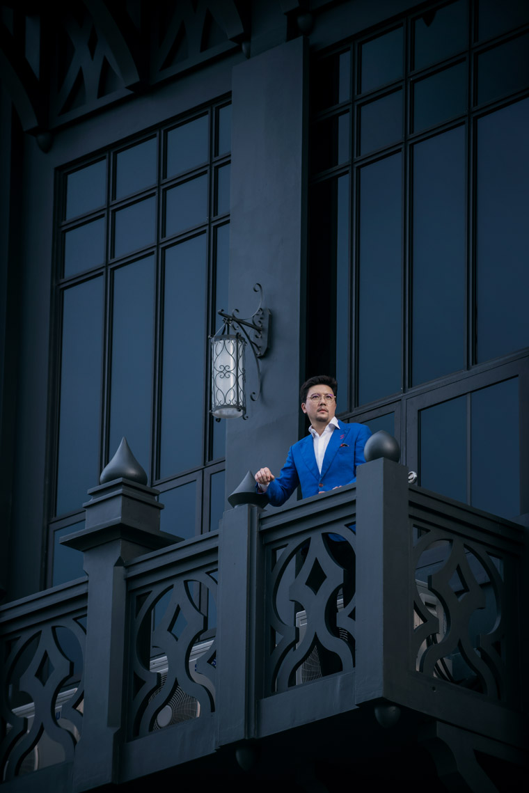
Next to its comparatively utilitarian neighbors, The Mill stands out. Conceptualized as an amalgamation of the art deco and Gothic architectural styles, and draped in a daring shade so dark it might rival Vantablack, the six-story structure been referred to as Gotham, a moniker that doesn’t endear itself to Mr. Teo. “I can see why, but still waiting for other terminologies,” he says.
“It does describe the building to a certain extent, but the story behind why it looks the way it does is because it's supposed to be a fortress in its ethos. I always believed the challenges and battles are fought outside of the fort, and when the team comes back they're supposed to feel fortified and protected. In my way, that was a way to create a safe haven for them to express their creativity — when like-minded people come together they feel that sense within the fortress.”
The Mill was remade in a process that took three years. The original building was a rice mill, “local, old-school and charming in its own way,” Mr. Teo recalls. But his design consortium and other occupants had outgrown the limited space, and the property’s plot ratio was underutilized, just half-used, so the idea to create a new building took root. At the same time, there was also a prolonged downturn in the property cycle, which resulted in lower construction costs, and adjustments to stamp duties on residential properties diverted investors to non-residential investments, such as commercial and industrial ones, he adds.
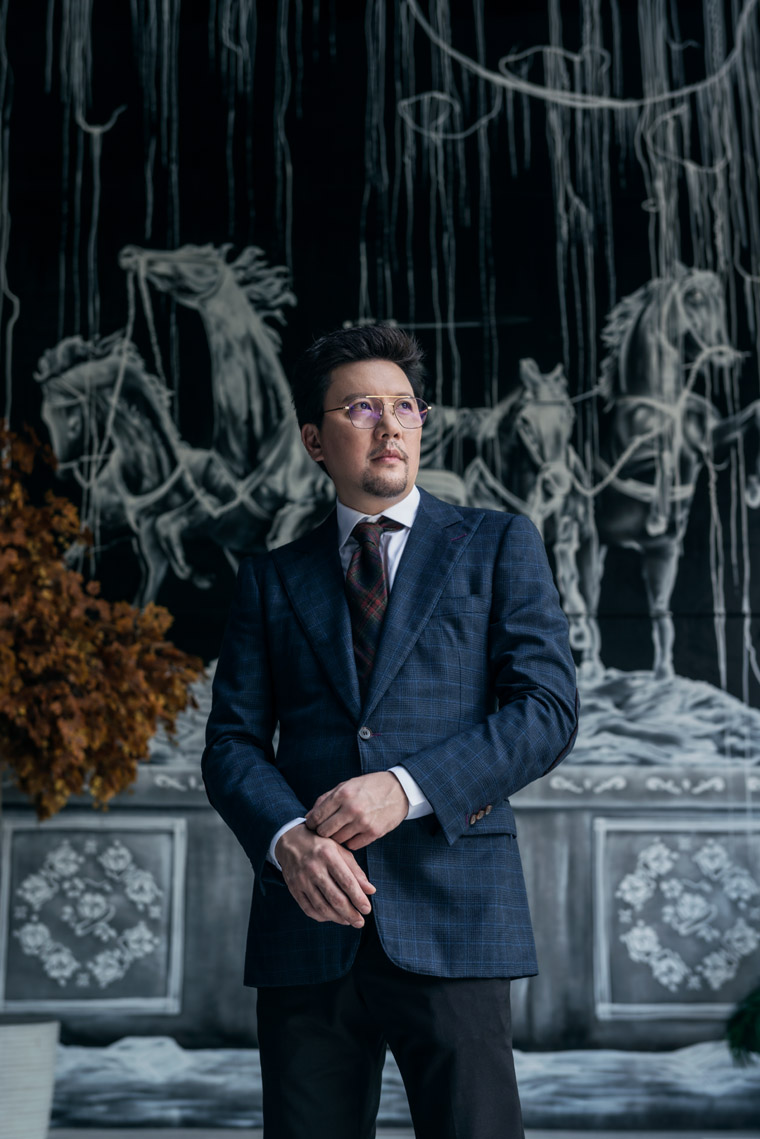
And Mr. Teo knew the style he wanted his new headquarters to bear. “I wanted it to look robust, it being an industrial building, somewhat strong in its persona,” he says. “Its location is central but it also has remnants of the old industrial estate — the old train tracks are still behind us. It made me think of the Meatpacking District in New York. That was another inclination to creating something old that had history in it. This is why the building is painted machine black, to make it look the part.”
Another influence was Soho interiors — lofty spaces, big windows, high ceilings, exposed structures — because the atmosphere calls to mind an old warehouse.
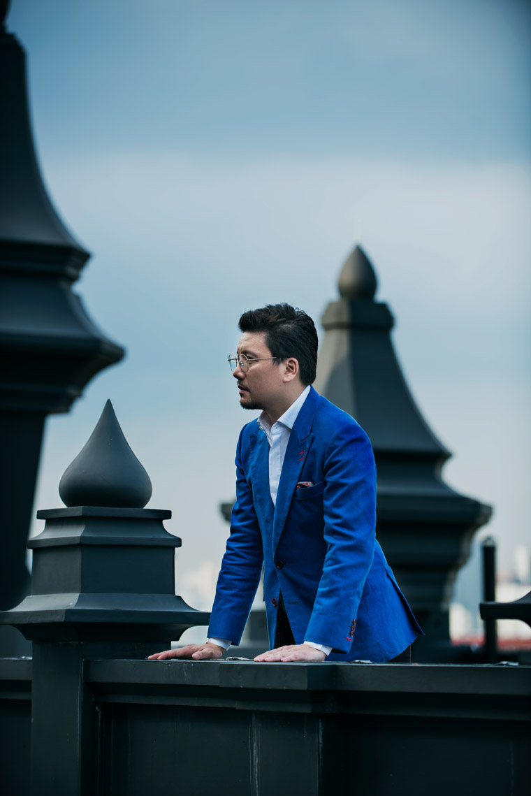
Arguably the most striking is The Mill’s exterior, inspired by art deco and its distinctive straight, robust lines and elegance, and Gothic architecture’s structures and spires. “Art deco is more than a style, it's an era, so I was backtracking at the time to find an era to replicate and to be the essence of the design style,” Mr. Teo explains. “The fact that I was doing two buildings gave me the opportunity to create yet another style. I thought, art deco buildings to me are very much like bank buildings, so I wanted an edgy, darker side to make a yin-and-yang duo, and then I thought, I'll try Gothic. And that was the difficult part, to marry the two stylistically.”
The designer selected for the task was James Adams, who designed Parkview Square. “To tie art deco and Gothic together, I don't know anyone better for the job,” Mr. Teo says. “He has a huge spectrum of resources and abilities to tap on various genres and eras and types of buildings, and he puts it together in a way that is quite seamless, and he has a way of splicing fantasy into different layers of his architecture.” Swan & Maclaren, the force behind Raffles Hotel, Goodwood Park Hotel and the current National Library, was brought on board too.
More than serving as a home for his design firms, The Mill was intended to house local creative talents, those who have the same values, like being a boutique firm and like being the best at what they do. “I'm thinking of using this more like an embassy,” Mr. Teo muses aloud. “I think it would be well-suited as an embassy for international artisans and creatives to have a base here.”
- DESIGN VISIONARY
- DESIGN BEGINNINGS
Design Visionary
Though his formal degree is in real estate, Mr. Teo has developed a signature style from among all the projects he has taken on. “They lean towards more traditional influences, gathered from years in UK — some say, the gentleman's style or heritage style,” he elaborates. “It's almost a cosmopolitan gentleman's home...a lot more of the man about town, who embraces technology, is up in the world but does fall back on heritage as a base. A lot of really good designs that are timeless are substantiated by tradition.
“I recognize that styles are always evolving and trends are cyclical, but the one thing that's ever increasing and evolving is creature comforts. The ability to design to the highest level of thoughtfulness is the backbone of good design.”
Within his design consortium are Kri:eit Associates Design Partnership, Splendor, The I.D. Dept and XXII Century. It all started with The I.D. Dept, a B2B firm that designed show houses for property developers. “Its culture wasn't quite suited to do the special projects I wanted to do,” Mr. Teo recalls. A developer would approach the firm to do four show flats in eight weeks, or bigger projects that comprised up to 16 show flats in two months, and that pace of work inspired Mr. Teo to explore other endeavors. “In many ways, Kri:eit was set up to do really special projects, and with these we are able to tap on the latest products,” he explains.
“These projects allow us to test things out, and the inventions we create at Kri:eit are then passed down to The I.D. Dept for the mass projects. so Kri:eit is like a professional prototyping testbed. Of course, sometimes the type of projects we handle at Kri:eit offers nothing to pass down, because it's just too unique, but it was started as a pet project company.”
Collaborations that Kri:eit has taken on include ones with Hunter Douglas to create from scratch custom C-channels for roller blinds that shield the windows of a Marina Bay Residences apartment, with interior architecture and design company Rinck to build a house in Singapore designed as a French chateau that required precise moldings, and with a clean-room specialist to study techniques for keeping spaces ventilated but germ-free and unpolluted.
Mr. Teo keeps his finger on the pulse of contemporary design trends and movements. He reveals he has been working on several projects involving co-living spaces: “It's like going back to the tribal days — people form clusters and get comfortable living with one another, which is not easy.” He names the 1980s as the design decade that’s set to mount a comeback, so keep an eye out for old geometric shapes, pastel colors, black and white checks and stripes.
And then there’s the fast pace of everything, probably the defining hallmark of this era, which has made a significant impact on how people approach design ideas. “A lot of people depend on design ideas from Instagram or Pinterest, and they go to their designers requesting those looks,” he explains. “Then what happened to that design process, of understanding what the person’s needs are? To me, design is this, in essence: If the master of the house is not there, you still feel his persona, and when he's there, design is the arsenal that complements and reinforces what he is.”
But social media has its upside. “In terms of my market research now, it's quite easy: We have this target market going for this condominium project, they’re of these ages and demographics, so what are they Instagramming? Let's create what they know so well, and once they step in, they go, ‘Ah, I understand this.’
“Marketing has changed.”
- DESIGN VISIONARY
- DESIGN BEGINNINGS
Design Beginnings
The styles Mr. Teo is best known for are a result of traditional influences he gathered from years living in the UK; he estimates he has spent about 20 years there, on and off. Nowadays, he spends more than half his time there. “I have a residence there, I have a whole life there, I've got a country home, a cottage in Cotswold,” he shares. “It’s the only detached cottage in the village, but I keep bumping my head because the ceilings are so low and there are beams running everywhere!” he adds with a laugh.
Mr. Teo counts the accessibility to good design he had in his childhood a critical influence on his career choice. “My mother (a property developer, “she builds buildings, but she's got a flair”) has always had a passion for travel and homes, and...in my early days, I had much exposure to interior designers,” he relates. “I remember working with a Japanese one, she turned to address me and right then I wasn't the kid in the meeting anymore. And she asked me very directly, ‘How would you like your room?’ I was probably 10...and I started giving my brief for the first time.”
Subsequently, due to a family-related business, Mr. Teo, then in his late teens, found himself on a trip to Vietnam where a Japanese architect was hired for a design project, and the meetings then carried on to Tokyo. “This guy had a really small office, his library was his meeting room. and he was a disciple of Kenzo Tange, his meeting was the sort that if one person wanted to get out, everyone had to climb out of this booth seat. but he was so dedicated -- Japanese -- I remember he wore Issey Miyake shirt, a different one every day, with a pocket going sideways.
“And we were on a train, on Shinkansen, i forgot what for, and he whipped out his NTT Docomo phone and started sending out texts to his staff in the office. And we would go for dinners, pretty compensating the way we would go at the sake and yakitori, and I thought, What a life! To be highly driven and passionate (about what you do). And that made me want to be an architect. so a combination of life experiences and the fact I had travelled quite a bit in my youth, and seen what was good style and good taste, made it easy to ease into this.”
He’s certainly made the right call, and dreams of bringing the best of many worlds together to create magical solutions. “that's who we should be, Asians with not the whole quick makeovers, but with deep thought in bringing out things I mentioned: living in this climate is different from living in Europe, so how do we evolve the design to be the best of both worlds, and I'm finding it fascinating being the bridge now, and if this could be the embassy or that fort for this to happen, even though we're trying create a design collective, we're not govt funded. we're a private enterprise trying to do without much help, but we try to live the dream.”


.jpg&w=347&h=240&crop-to-fit)


 Back
Back
